-
E1 — Type in Motion
Before we begin this exercise, let's learn the basics of After Effects.
Much of what makes animations feel good is based on evoking a sense of natural rhythm and timing. In the late 1800s, Eadweard Muybridge studied the movements of animals by documenting motion through photographs. In his studies, he created a stop motion effect that allowed us a glimpse into how creatures move. As still images, you can observe the physiology of the animal, and in motion, you can see it come to life. While the photos are doing the heavy lifting, imagine what this animation would look like if the timing was off.


In the horse examples, the animation is achieved simply by flashing different photos, or frames, at a set interval. The first example feels better to us because it looks natural, while the latter feels unnatural and choppy.
With a few very basic animation principles (changing opacity, transforming scale, adding rotation, adding movement, changing the viewport and looping) you can achieve a lot. Focusing your efforts on consistency and graphic language will help establish a tone for your animation, and modifying the timing and rhythm will help simple animations feel natural and inviting.
Task
Create an animated, typographic poster for the upcoming exhibition that utilizes a looping animation.
1 - Begin by assessing the hierarchy.
2 - Include the title of the exhibition: Artist as Visionary as Innovator as Architect as Seer
3 - Consider how to meaningfully add motion to the typography.Specs
Dimensions: 1080 × 1920
File Format: .mp4 < 5mb; 24fps
Length: 15 seconds; (should loop seamlessly)Examples
Edwin S. Porter, College Chums (1907)
Marcel Duchamp, Anemica Cinema (1926)
Saul Bass, Psycho title sequence (1960)
Tom Kan, Enter the Void title sequence (2010)
Dexter Sinister, Letter & Spirit (2013)
Zipeng Zhu, ELECTRICA Moving Typeface (2014)
Shira Inbar, intermission graphics for Little Cinema (2017)
Student work from ECAL Graphic Design, led by Mitch Paone, founder of Dia Studio (2019)
Haha.Services
Mitch Paone of DIA, Time is Form/Form is Time (not the best audio)Credits
This exercise was created by Nika Simovich. The After Effects tutorial was created by Jacob Rivkin. Both teach different sections of Design 3A at Rutgers.
-
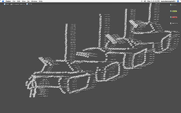
E2 — Desktop Portrait
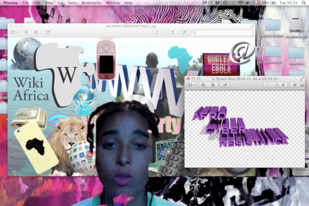
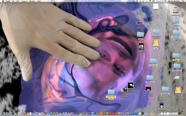
The opening of Jason Huff’s Rhizome article states:
A desktop is a changing record of visual decisions. It speaks to the aesthetics of a particular work-flow and personal space. A desktop exhibits a diagram of your organizational habits and a screenshot of it captures a brief moment of its functional evolution. The image of your desktop becomes an intimate self-portrait and the impulse to decode an unfamiliar desktop is unavoidable.Instructions
1 - Use the existing abilities of your desktop to create a desktop portrait.
2 - Consider... changing background image, background color, adding/rearranging folders and assets, scale... what else?
3 - Take a screenshot.
4 - Name the image "FirstnameLastname-Title.png", e.g. "MindySeu-Blobject.png"
5 - Add to this folder and we will share next week.References
— Rhizome’s Beyond the Surface: 15 Years of Desktop Aesthetics, Note: several links in Huff’s article are broken. You can google them, or refer to the inline images
— Design Observer’s Where We Work
— Alexei Shulgin’s 1997 Desktop Is and About
— Tabita Rezaire, Afrocyberfeminisme
— Martin Murphy
— Camille Henrot, Grosse Fatigue
— Justin Strawhand
-
E3 — Coding from Life
Instructions
1 - Download this starter kit.
2 - Make a still life drawing using only HTML and CSS.
3 - Upload the drawing to your portfolio site
For more information on accessing your site on Rutger's servers, please view: art.rutgers.edu/new-server-environment-information-for-fall-2018
4 - Add your link to this week's doc.Specs
Please include:
— all objects
— one texture, drop shadow, or gradients
— one CSS animationResources
pattle.github.io/simpsons-in-css
css-tricks.com/the-shapes-of-css
bennettfeely.com/clippy
cssmatic.com
devdocs.io/css
devdocs.io/htmlThis exercise was originally created by Laurel Schwulst. See more Coding from Life projects in this Are.na channel.
-
E4 — :hover
Since the inception of the personal computers, our main interactions with the digital world have been through a desktop interface. A metaphorical workspace where a mouse pointer is our primitive avatar, a waste paper basket is a digital recycling bin, and our ‘files’ are stored in ‘folders’. With massive adoption of touch devices, the desktop interface may soon be a thing of the past—a blip on the digital interaction timeline. As we move to this new touch interaction model, it’s curious to consider what interactions and metaphors will no longer be relevant and forgotten.
This exercise asks you to investigate the desktop interface, specifically through its unique interaction of the hover state. Hover states are considered a ‘pseudo state’, something explicitly thought of as in-between. They occur when your mouse cursor is positioned above another element on the page and act as an on/off switch with only one level of interaction. Even with these limited capabilities, they’ve become a key aspect of desktop web design.
Instructions
1 - Download this demo file.
2 - Use rollovers within the demo file to do the following:
— Change the case of text (U&lc, ALL CAPS, etc.)
— Fade-in an element.
— Select preceding elements.
— Move an element using translate.
— Rotate an element and change its color.
3 - Working in pairs pick physical metaphor and imagine how you would interact with it in the digital world (a light switch, clock, pair of scissors, nesting dolls). Create a rollover interface to explore this notion.
4 - Add link to this week's google doc.Resources
http://www.w3schools.com/cssreF/sel_hover.asp
https://css-tricks.com/almanac/properties/c/cursor/
https://css-tricks.com/using-css-cursors/
https://daneden.github.io/animate.css/
https://www.gradient-animator.com/
https://css-tricks.com/almanac/selectors/n/nth-child/
https://developer.mozilla.org/en-US/docs/Web/CSS/CSS_SelectorsReferences
http://rojanasakul.com/interpretation.php
http://collectie.hetnieuweinstituut.nl/en
http://www.praneetsoi.info/
http://www.andrewherzog.com/
http://thewilderness.space/
http://www.colorflip.com/
http://common-room.net/Credit
This exercise was originally created by Chris Hamamoto.
-
E5 — Responsiveness
This artworks by Aram Bartholl illustrates a variety of screen sizes. Depending on the model, brand, and resolution of your device, sizes change minutely from screen to screen. In order to accommodate for this, designers and developers build sites to flex inside the browser. Rather than fixed units, variable units are based on percentage or scale. Today we will play with variable units, media queries, and Flexbox.
Instructions
1 - Download these starter kits: breakpoints, flexbox
2 - Breakpoints
— Change the images and text
— Make the font change for 3 breakpoints
— Remove 2 elements for the mobile site
3 - Flexbox
— Add images and change the text
— Change the width of the columnsReferences
css-tricks.com/snippets/css/a-guide-to-flexbox
css-tricks.com/css-media-queries
w3schools.com/Css/css3_mediaqueries_ex.asp